Your sales and customer
contact, mapped and
measurable.

The Pulse is a real-time, visual overview of sales performance—filtered by region, rep, or time period to track trends and identify opportunities. With dynamic maps and data tables in sync, clearly see where your sales are coming from.

Map of Brisbane, Australia and surrounding areas, showing color-coded markers and a heatmap indicating data distribution.
A colorful heatmap chart showing intensity levels from N/A to 100% with color codes from gray to red. Below is a section titled 'Lead Status' with color codes indicating none, win back, reminder, upsell, and contacted.
Screenshot of a filter menu with options for Sales Rep, Customer Territory, Customer Region, and Customer State, each with dropdown menus labeled 'Show All'.

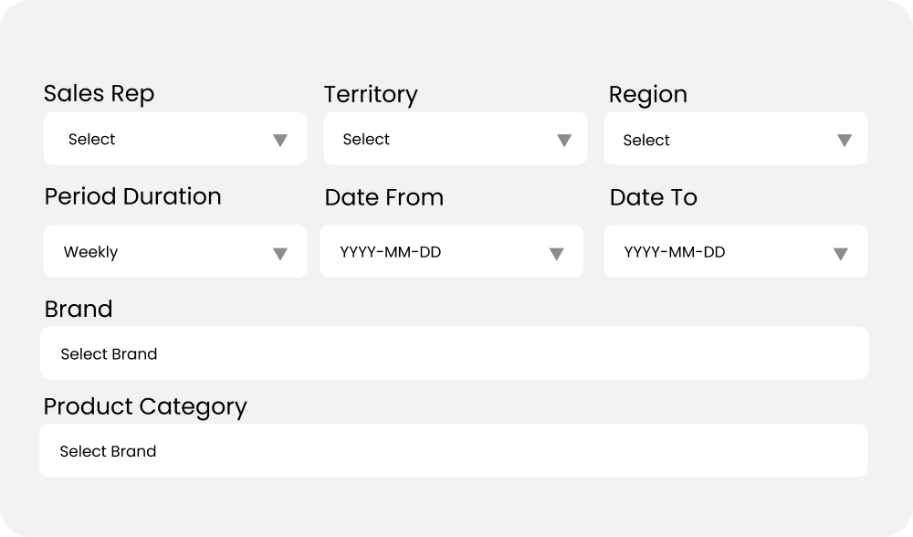
Build your own birdseye view

Cumulative and Period-Based Views
Toggle between overall sales and specific time periods for a detailed breakdown.

Black and white icon of a face mask with three horizontal lines representing filters or breath ventilation.

Customizable Map
Show or hide data points to focus on key areas of interest.

Icon of a person standing on a map with a pin marker.

Seamless Export
Export maps and data tables separately for easy reporting.

Black square icon with a white downward arrow pointing towards a horizontal line inside a square outline, representing download.

Real-Time Sync
The map and data tables update instantly as you apply filters, keeping everything aligned.

A black background with a white infinity symbol in the center.
A man in a light gray button-up shirt working on a laptop at a wooden table, with pinkish blurred background.
Screenshot of a sales data filter form with dropdown menus for Sales Rep, Territory, Region, Period Duration, Date From, Date To, Brand, and Product Category.

Detailed Insights Direct from MYOB Acumatica

The Pulse gives you a full breakdown of sales performance. To focus on critical insights, sort and filter data by time period, region, or rep. Drill down into the details, and when you're ready, export the tables to Excel for further analysis or reporting outside the platform.

Map showing locations around Queensland, Australia. There are colored pins indicating specific areas, with one pin highlighted in pink labeled 'Super Fish' with sales statistics in a pop-up window.

Integrated Map and Data Tables

The Pulse and its accompanying data tables are fully integrated. Adjust any filter or selection on the map, and the data tables and charts update instantly. This seamless integration ensures your sales performance data stays aligned, providing real-time, accurate insights without any extra effort.

Two business professionals, a man and a woman, working together in a warehouse, reviewing documents and discussing logistics.
Line graph showing contact count in pink and contact trend in blue from week 30 to week 34 of 2024, with contact count starting at 18, peaking at 44, dipping to 33, and then rising again to 48. Contact trend starts around 40%, dips to 25%, then increases to 40%.

Made for management

The Pulse gives sales managers complete visibility into team performance.

Use the heat map to highlight underperforming areas or accounts, allowing for swift, targeted actions.

White heartbeat line or electrocardiogram on a black background

Leveraging detailed data tables and trend analysis that moves with your map and filters.

White heart rate line graphic on black background.

Identify opportunities for coaching or training to boost team results.

A white heartbeat or electrocardiogram line on a black background.